evaluation-
when making my posters i used different softwares such as photoshop and the graphics software Canva i didn’t really use photoshop to make a poster or a sample i used it to experiment with and to see if i wanted to use it as a software rather than Canva. I made a few samples before i made my actual design these samples were to help me get used to using the software and to make sure that i could make the poster the best standard.
sample one
for my first sample i used a graphics software called canva and i chose my images by using the one that were available on the software apart from the one that has the phone which i took myself. i used a random title so i could experiment with the different fonts and to see how it would look as a finished sample.
sample two
for my second sample i used images off canva so i could experiment with different fonts and see what images i could use to make my finished design and to see what certain images would look like layered with each other. I also used a random title as this was another mockup. the whole purpose of this mockup was to help me figure out my final design.
final design
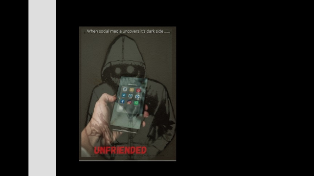
for my final design i used both my own image and ones that i found on the software i added a filter and altered the transparency so that the phone and the hooded figure lined up and matched up so that it looked more clean and finished. i also changed the texts so that they looked better and more put together. i added an age rating and other pieces of text to make it look like more of a film poster. i chose to use red text as this is something that common in horror film and on horror posters. The hooded figure is also associated with horror along side the actual title of the film “year end” and the tagline/slogan at the bottom with the use of the word fear and the fact that the person is looking at something on social media these are all codes and conventions of horror movies and posters.

how i met the brief
i met the brief as i followed the codes and conventions of the brief as i made sure the poster didn’t contain anything that could inflict pain or harm upon others, i made sure the fonts and graphics fit in with the codes and conventions of horror posters/films, i made sure that the film poster was aimed at the right target audience and that it was on budget. i made sure the photography matched the style along with using appropriate colours such as red and black.
